The Round Robin Database Tool (RRDTool) is free software, is a database management tool created by Tobias Oetiker. It is used by many open source tools, such as Cacti, collectd, Lighttpd, and Nagios, for backing up cyclic data and plotting graphs of chronological data.
@ST.◕‿◕.🇨🇦
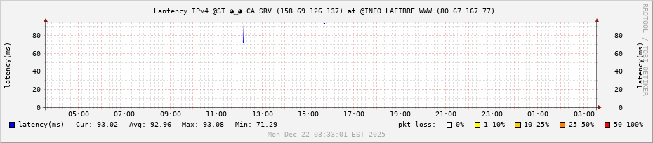
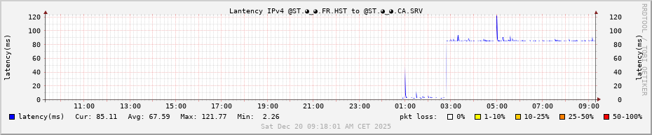
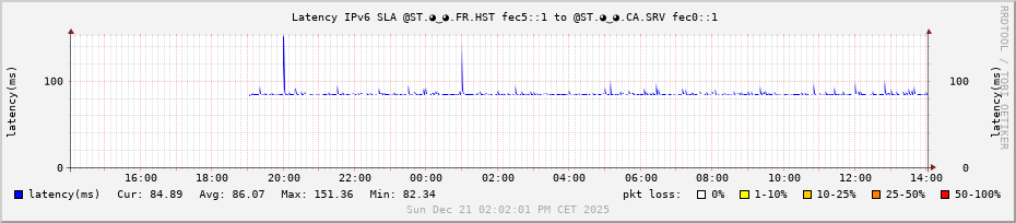
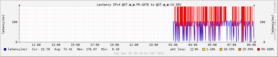
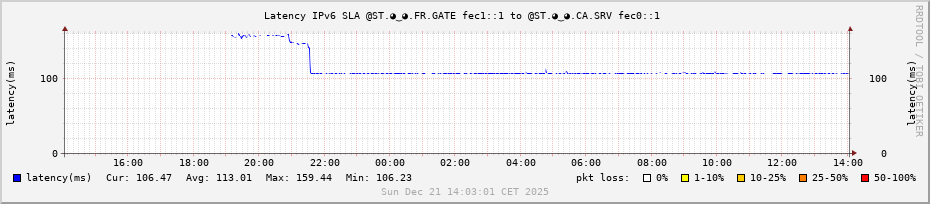
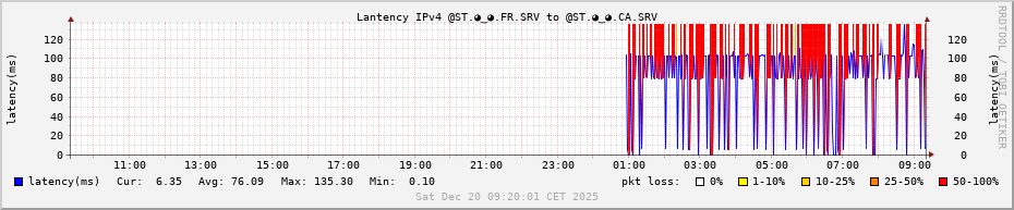
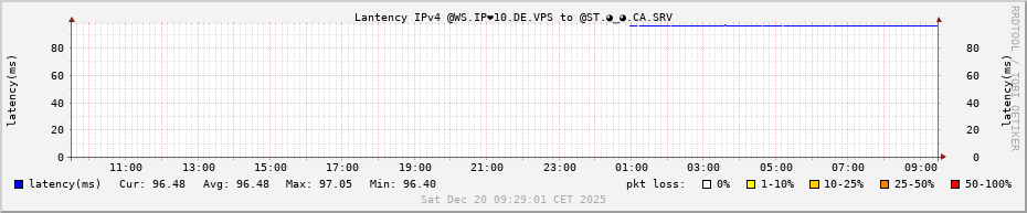
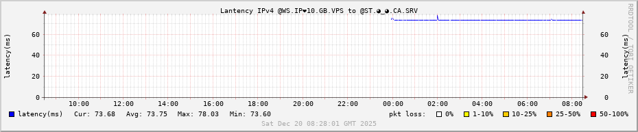
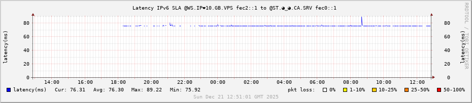
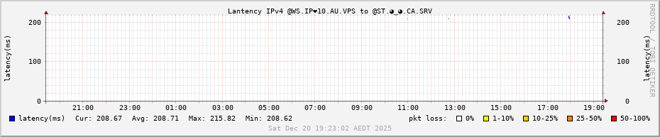
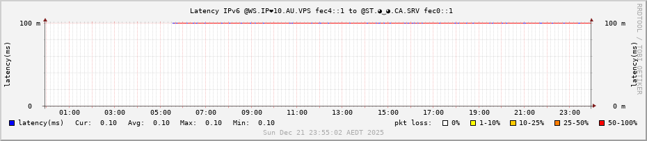
Connection on ASN 16276 OVHCloud in Montreal (CA), Canada (UTC-5).
@ST.◕‿◕.🇫🇷
Connection on ASN 47583 Hostinger in Paris (FR), France (UTC+1).
Connection on ASN 3215 Orange S.A. in Valdeblore (FR), France (UTC+1) at home, right at the very top of the mountain, the last one in the line.
@WS.IP❤10.🇩🇪
Connection on ASN 16276 OVHCloud in Frankfurt (DE), Germany (UTC+1).
@WS.IP❤10.🇬🇧
Connection on ASN 16276 OVHCloud in London (UK) - Great Britain (UTC+0).
@WS.IP❤10.🇦🇺
Connection on ASN 16276 OVHCloud in Sydney, New South Wales, Australia (UTC+11).
- Web Page Owner : ZW3B’s LAB3W : The Web’s Laboratory ; Engineering of the Internet
- Web Page Author : O.Romain.Jaillet-ramey (orj AT lab3w.fr) on LinkedIn, Collective.Work, GitHub, Debian-FR.org, LaFibre.info, Facebook, Twitter (X), Instagram and Youtube, Steam Community.
- Web Page Date Created : 2025-12-20
- Web Page Date Modified : 2025-12-20
- Web Page Description : Graph Latency on ASN 16276 OVHCloud in Montreal (CA), Canada (UTC-5).
-
Web Page Graph Round Robin Database (RRD) : A Simple Example: Ping an IP and graph it
Explaining the graph : The graph shows both the round trip time (rtt) and packet loss (pl). The rtt is graphed in blue. The packet loss is the background area color of the graph over the time frame the loss was experienced. If there is _no_ packet loss then the background is white like the example. If there is packet loss then the background will shade from yellow to red depending on the severity of loss. We are graphing 24 hours of data at a 1 minute granularity and the times are on the x-axis on the bottom. The y-axis is automatically scaled depending on the data collected and shows the latency in milliseconds (ms); the y-axis legend is printed on the left and the right sides. The title is in black at the top and at the bottom in a watermark (light gray) is the date and time the graph was created. When reading the graph remember that new data is on the right and the oldest data is on the left.